This weekend I am at a ski camp. I plan to ski a lot to get my ski grade by the end of this camp. But this is a trip after all. I drank with my companion until late at night. When dawn broke, I was skiing with a terrible hangover. But, oh well, it's fun.
New Illustration
Well, I've been working on illustrations this week, and I posted one fan art on January 25.
They say this year's climate made the citrus sweeter. No matter which bag of citrus you buy, they are sweet. Well, this has nothing to do with this, but it is an illustration of citrus picking. This was created in response to a request I received on skeb.jp. I am waiting for your illustration request on Skeb!
Looking Back
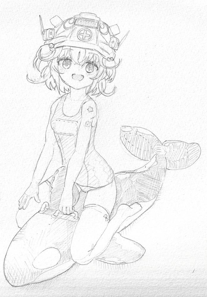
I write a review note for each illustration. I look back at that note. I am not good at expressing shadows. In this note, I write about how I was able to overcome this difficulty a little.
I was able to successfully manage the layers of the helmet's shadow that spans multiple parts. Shadow management has been an issue for a while now, and I have yet to figure out how to do it. To avoid complicating the management, I tried to use a single multiply layer for the shadow layer. However, this makes it difficult to draw the intersection of the unevenness of the hair and the shadow falling from the hat. For the time being, I put the shadow of the hat on a separate layer and drew it before painting the other shadows. Then, since there are not so many overlapping shadows in the whole picture, I think I can overcome this problem without being unable to manage it. Distinguish them as shadows with shadows underneath. It's okay if you decide on the design ahead of time instead of painting haphazardly.
Another well-done job was the use of three different colors for the wrinkles on the float: shadows and highlights. Also, the spots on the starfish were a good value for the time and effort required to create a three-dimensional effect and a sense of being there.
Regarding the character's design, she has a fine, curly tuft of hair at the four corners of her head. This works as a symbol for a fine, soft head of hair. How interesting and useful for me.
Character practice sketch
I drew the eyes mostly copying the original artwork. I think it looks uncharacteristic of me. Her iris looks a little darker.
In the original artwork, which is a reference, the costumes and equipment are complicated anyway. It is difficult to decide to what extent to adopt and depict the equipment of the setting. In this illustration, I picked up almost all the items in the reference. I wanted to make an appeal to the viewer by saying, "I looked at it carefully and didn't draw it in a random way. However, I should not have picked up the console wrapped around my arm. It would have conveyed the pose of a hand in a pocket.
On this note I am writing about shadows again. I'm not very good at shadows. But thanks to a theory I realized at this time that not many complex shadows overlap, I'm overcoming my dislike of them a little.